#𝔸𝕝𝕝𝕄𝕖𝕥𝕖𝕣𝕤
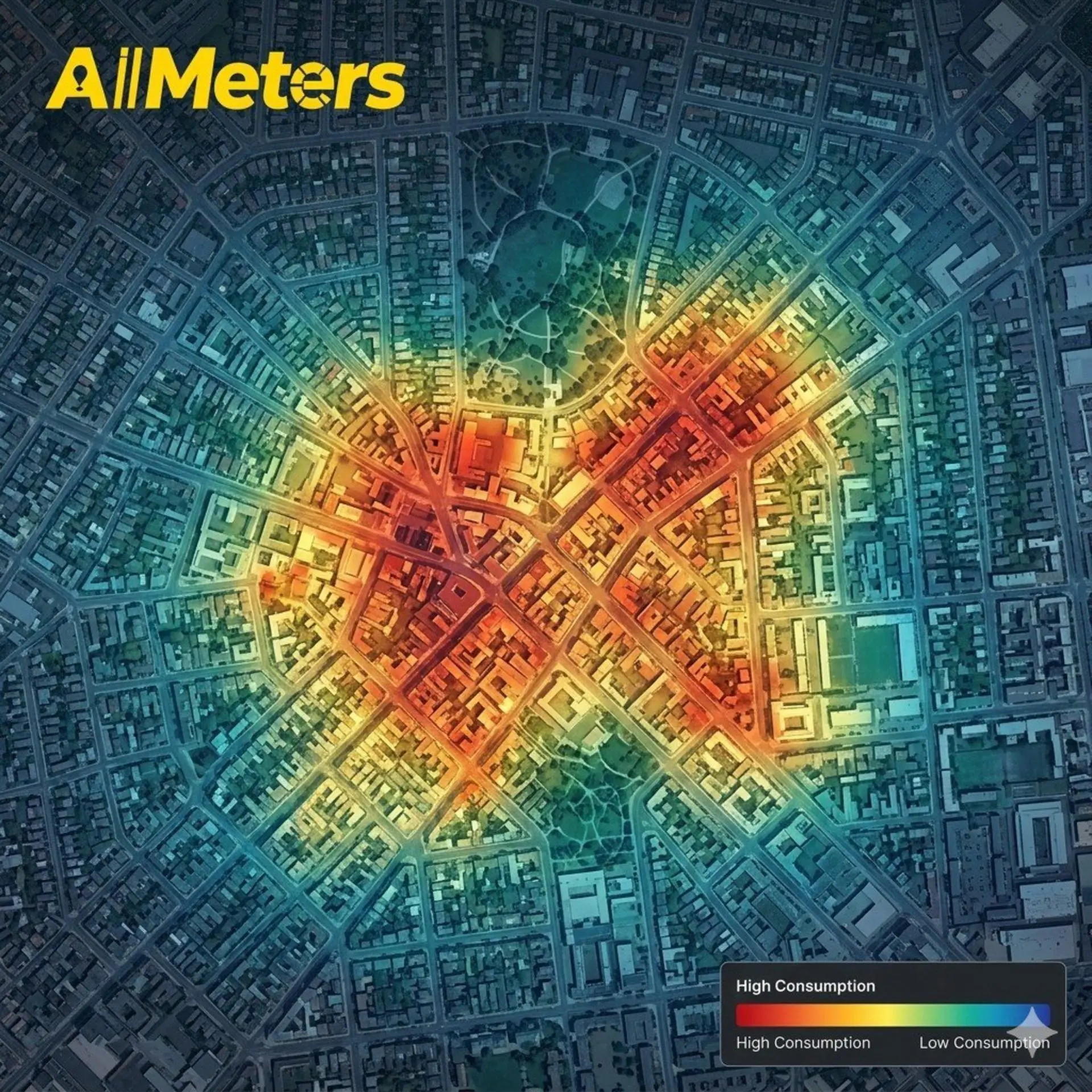
🗺️🔥 Consumption heatmap: Visualize where the most is being consumed!
With AllMeters, providers can see:
📍 High consumption areas (red)
📍 Medium consumption areas (yellow)
📍 Low consumption areas (green)
📍 Anomaly areas (blue)
📊 Plan your infrastructure based on real data!
🔧 Prioritize investments smartly!
👉 www.all-meters.com
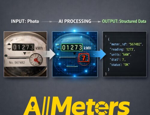
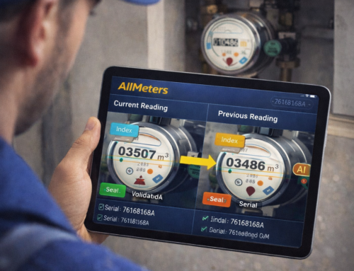
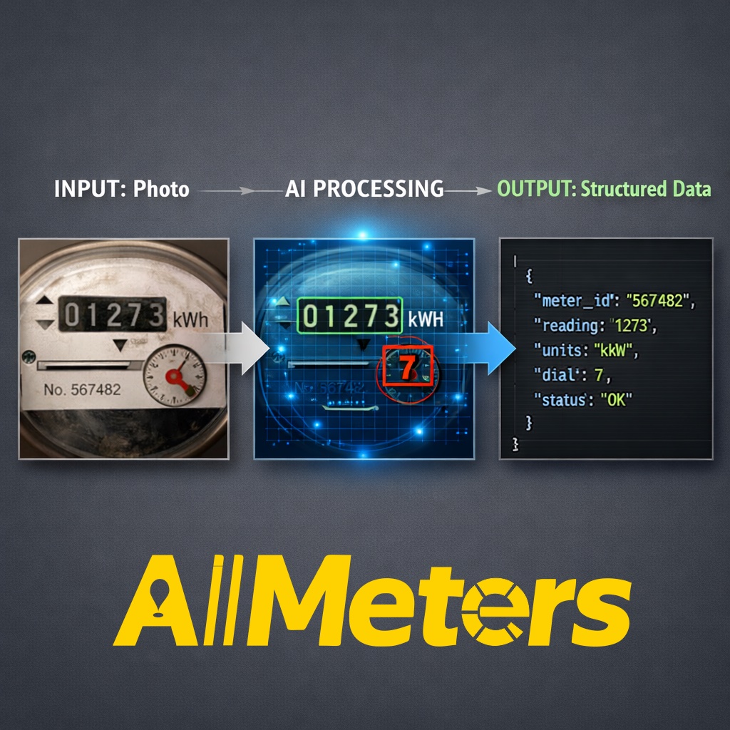
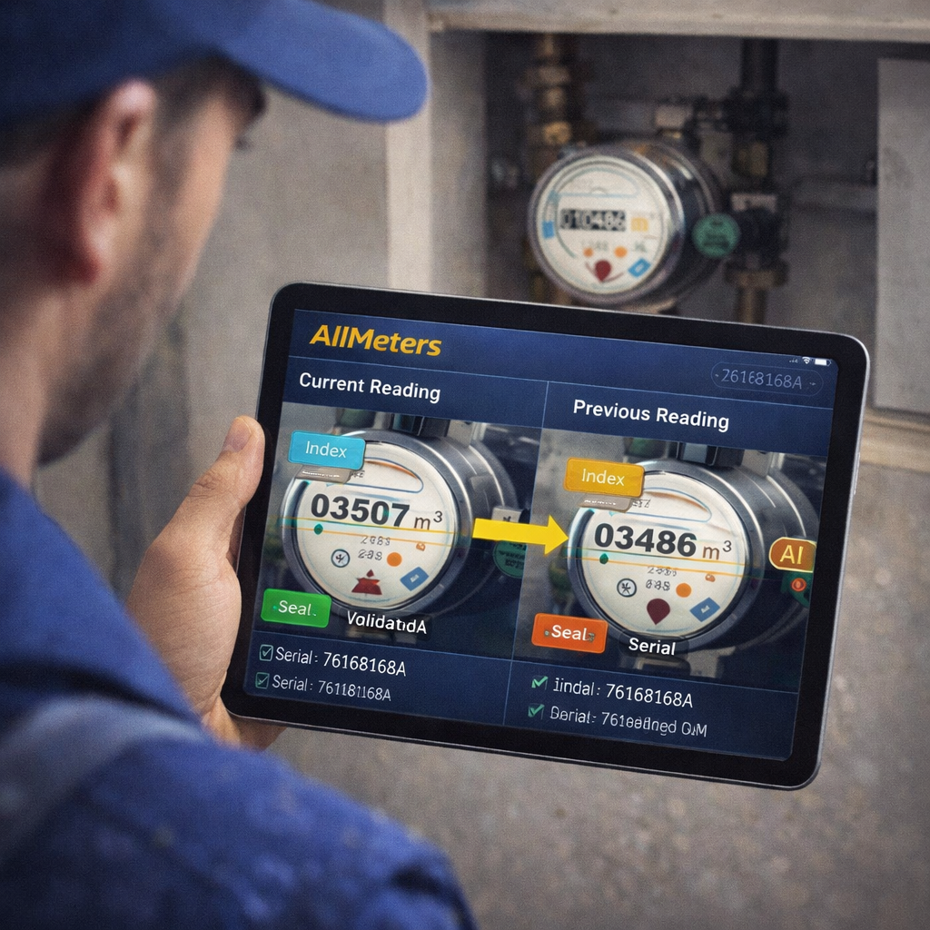
🤖 AllMeters uses AI throughout our stack: meter detection, chatbots, and social media visuals.
This image was created with AI to illustrate our vision.
#AllMeters #Heatmap #ConsumptionMap #DataVisualization #InfrastructurePlanning #SmartUtilities #GeoAnalytics


Leave A Comment
You must be logged in to post a comment.